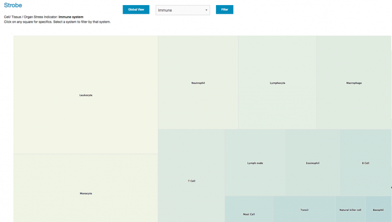
Opus 23 provides many unique opportunities for data integration and visualization. One app that I’ve just been added to the Opus toolbox is STROBE, a new Opus analytic app that allows you drill-down client genomic data by organ, tissue or cell distribution. To do this Opus mashes up its own internal SNP data with gene tissue expression data derived from a variety of public databases. I then sub-organized the tissue expression data by system (immune, cardiovascular, etc) so that the user could filter by clinical relevance.
Once STROBE is fired up you’re presented with the screen depicted above. It is a typical squarified heat-map rendered in Highcharts. Values are assigned by virtue of the aggregate power factors of client SNP mutations number of genes associated with that tissue. Clicking on any tissue brings up a modal popup with a Manhattan-type gene distribution display.
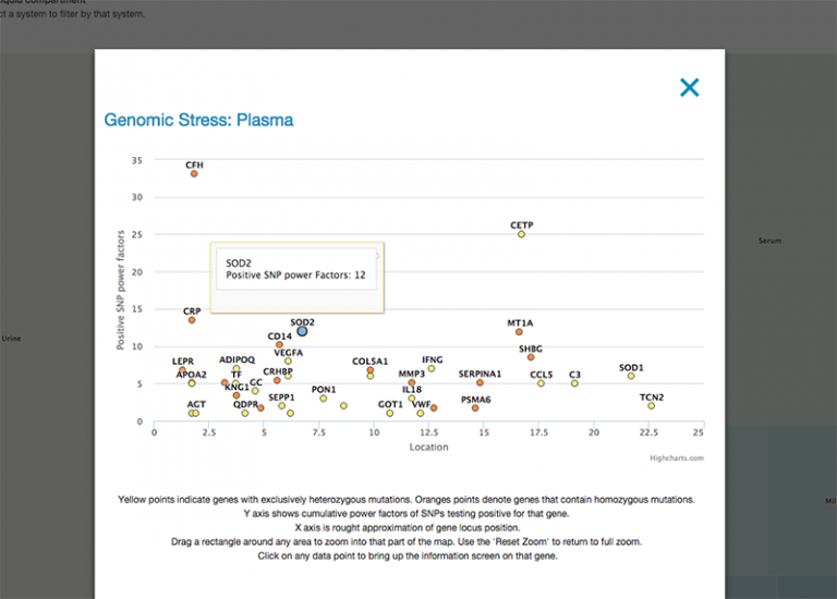
Y axis shows cumulative power factors of SNPs testing positive for that gene. The X axis is rough approximation of gene locus position. Yellow points indicate genes with exclusively heterozygous mutations. Orange points denote genes that contain homozygous mutations. Drag a rectangle around any area to zoom into that part of the map. Use the ‘Reset Zoom’ to return to full zoom.
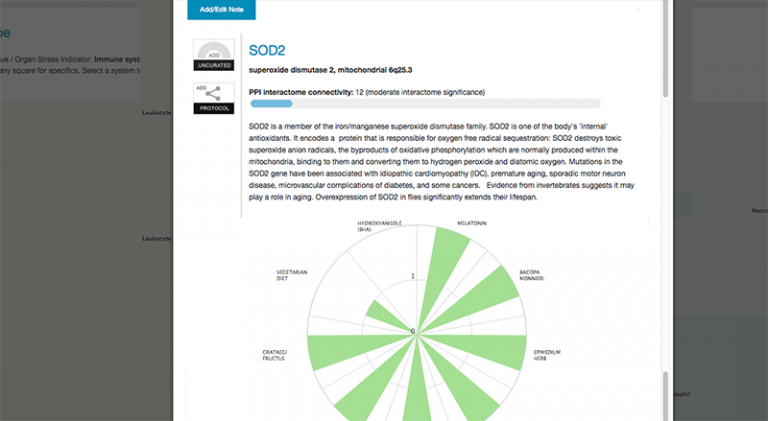
Clicking on any data point to bring up the information screen on that gene. Here you can notate, or even move on to examining SNPS, agents and algorithms associated with the gene.
From them main screen you can use the select pull-down menu to limit tissues to specific systems. Here we limit the display to tissues, organs and cells of the immune system: