PANSOPHIA – sequential outcome analysis
The genomic DNA analysis software Opus 23 includes the Utopia suite of apps for analyzing sequential uBiome data, comparing sequencing-based clinical microbiome data with the client’s own genomic DNA.
![]()
PANSOPHIA is an Utopia app that gives you the power to sort your client’s data based upon associations with health and disease as well as several other useful categories including keystone, probiotic, core species and butyrate production. For those clients who have more than one data sample, PANSOPHIA allows you to visualize treatment progress in a graphical format that can be easily added to your client’s report.
Navigating PANSOPHIA

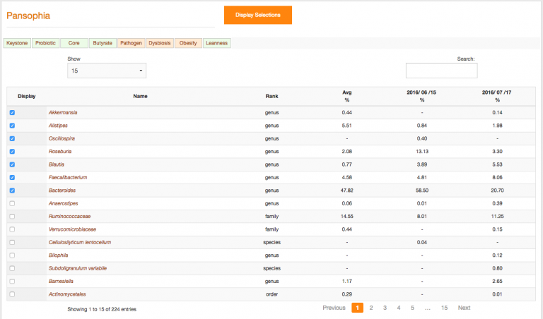
From the Utopia drop down menu, hover over ‘analytics’ until a second list appears, then select PANSOPHIA. You will then be presented with the default table which shows ‘everything’ and is sorted by ‘rank’ or ‘percent’.
At the bottom of the window is a jump screen that allows you to move from one screen to the next. You can control how many rows to display be selecting an option from the ‘Show’ pull down menu. The default is 15.
Filtering and sorting results
PANSOPHIA allows you to parse the taxon data based upon desired treatment goals. Taxa are sortable by benefit as well as pathogenic potential. There are two ways to filter the data.
Using category tabs:
You can use the category tabs at the top of app’s main screen to select taxa grouped by their associations with health and disease. Once a category is selected, the information will be displayed in graph form.
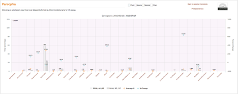
The PANSOPHIA graph uses the following symbols:
- An orange dot ◯ denotes average %, the bar graphic represents the client data- specific %
- For those with multiple data sets, a blue diamond ⃟ denotes % change
Click on any desired taxon to open up its information pop—up window for detailed information including taxonomy, an overview of known disease or health benefit associations, interactions and metabolomics. Click ‘add/ curate’ to include it in your clients report. Additionally, the graph itself can be printed or added to your client’s report.
Using individual taxon selections:
From the main screen, you can sort the taxa by ‘name’ or ‘client %’ then select desired taxa individually using the display box selections on the left hand side of the screen. Once you have made your selections, click the orange ‘display selections’ button at the top of the screen. The individual taxon information will be displayed in graph form. Click ‘add/curate’ to include the graph in your client’s report.